Design
Interfaces people finish using
The screens that break products are the ones nobody drew: empty states, loading, partial data, permission errors, the row with a 90-character name in it. We draw those, because otherwise engineering invents them at 5pm on a Friday.
-
Every state, not just the happy path
-
Prototypes engineers build from
-
Accessibility annotated from screen one
What the work includes
-
User flows and information architecture
-
Wireframes where they earn their keep
-
High-fidelity screens for every state
-
Interactive prototypes for testing and handoff
-
Responsive behaviour from mobile to desktop
-
Accessibility annotations — contrast, focus order, labels
-
Component specs named to match your code
High fidelity early, deliberately
Abstract wireframes hide the decisions that matter. A grey box labelled 'chart' defers every hard question — what happens with one data point, or ten thousand, or none — until someone is already building it.
We work in high fidelity early so those questions surface while they are still cheap to answer. Wireframes still have a place for mapping a flow nobody understands yet, but they are a means rather than a deliverable.
Research proportionate to the stakes
We are not going to run a twelve-week discovery on a settings page. For most work your existing analytics, your support tickets, and five customer calls tell you what you need to know.
Where the territory is genuinely new we will say so and scope real testing rather than guessing confidently. Knowing which situation you are in is most of the value.
Analytics and session review before anything is drawn
Usability sessions on flows with real revenue consequences
Nothing dressed up as research that is really just opinion
Built to hand off
A design engineering has to interpret is a design that ships differently from how it was drawn. Components are named and structured to match code, spacing comes from a documented scale rather than being eyeballed, and tokens are declared rather than implied.
Proof it works
All case studies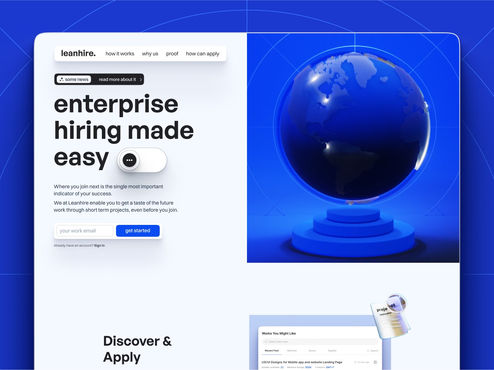
Leanhire
Hiring Made Easy
Brand, site, and product design for Leanhire, a hiring platform where candidates run a short paid project before accepting a full-time role.
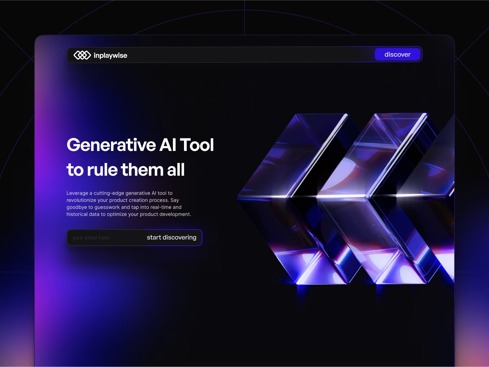
InPlayWise
Efficient betting on sports events
Brand, site, and product design for InPlayWise, an AI platform surfacing live in-play sports signals for bettors who decide in seconds.
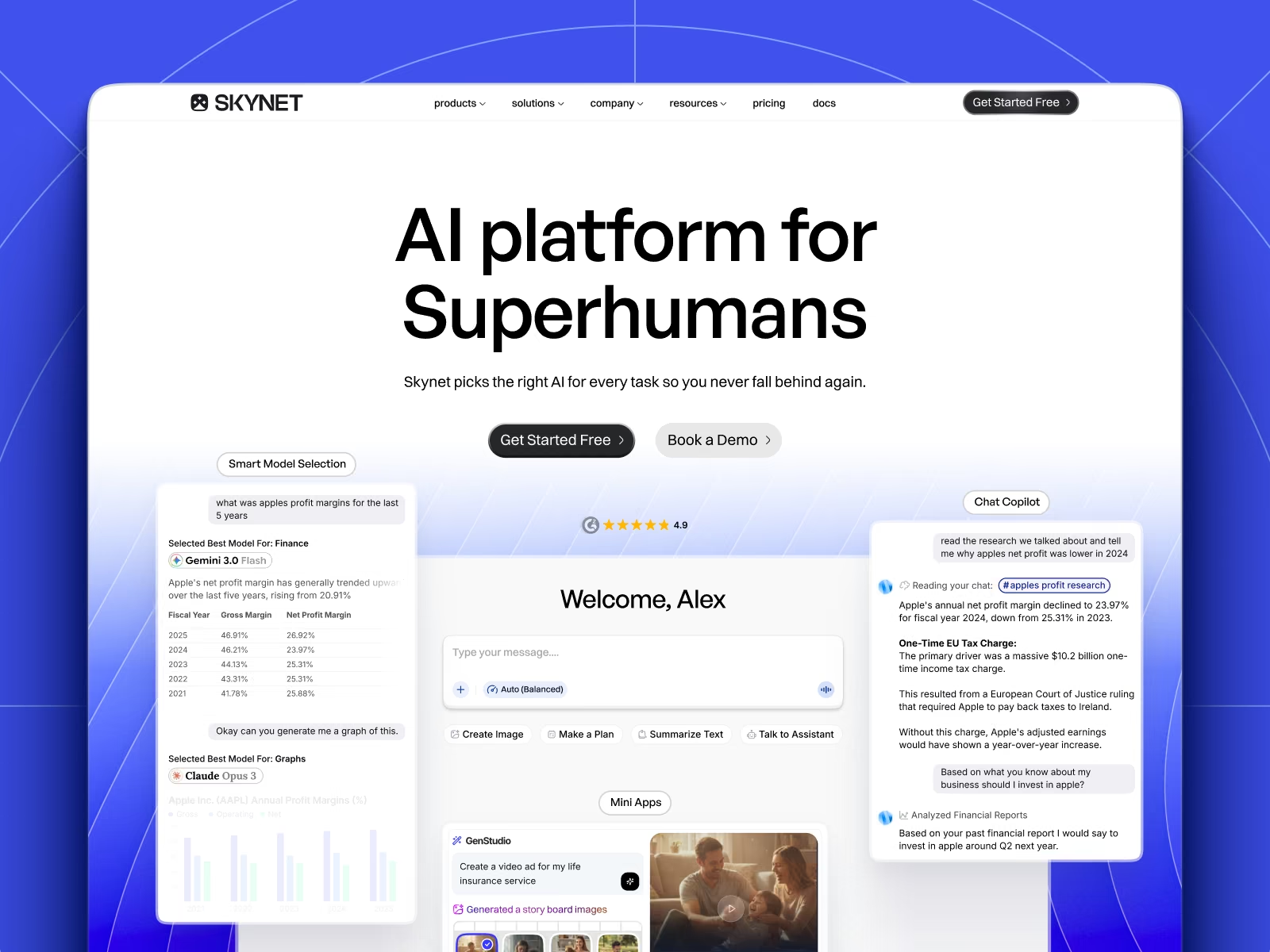
Skynet
Brand and product for an AI workspace
Brand identity, marketing site, and product design for Skynet, an AI platform that routes every task to the right model across 20+ providers.
Frequently asked questions
Lightweight research — interviews, usability sessions, analytics review — yes. Large-scale quantitative studies are better handled by a specialist and we will tell you when that is what you need.
Figma, in a shared file you have full access to from day one.
That is the intent. Components are named to match code, with spacing and tokens documented rather than implied.
UI/UX is the craft of the interface itself. Product design starts from a metric — activation, retention, upgrade rate — and works backwards to the interface. Most engagements need both; they are separate pages because they answer separate questions.
Let's build something worth shipping
One flat monthly fee. Unlimited requests. Design and engineering under one roof — pause or cancel whenever you like.