Anyone can make something on-brand
Documented rules mean a new landing page or ad set can be assembled by your team without a designer in the loop.
Design
Most identities are designed for a presentation deck and fall apart the moment they meet a real interface. We design yours against the three places it will actually live: your product, your site, and your pitch.
First direction in 5–7 days
Delivered as a usable system, not a PDF
Editable Figma source files
Documented rules mean a new landing page or ad set can be assembled by your team without a designer in the loop.
Tested at favicon size and full-bleed, on light and dark surfaces, in product UI and in print.
Systems age better than trends. We design for the next three years, not for this quarter's aesthetic.
Primary logo, mark, and lockups
Typography system with webfont licensing guidance
Colour palette with accessible contrast pairs
Iconography style and a starter set
Brand guidelines covering usage, spacing, and don'ts
Social and presentation templates
Editable Figma source files
A mood board tells you how a brand feels. It doesn't tell you whether the mark reads at 24 pixels, whether the type holds up in a dense table, or whether the palette has enough contrast to pass an accessibility audit. Those are the questions that decide whether an identity is usable.
So we design the mark alongside the three surfaces it has to work on: the product interface, the marketing site, and a pitch deck. If it fails on any of them it isn't finished, regardless of how good it looks in isolation.
If you already have a brand, starting over is usually the wrong call. An existing mark carries recognition you have paid for in time and money, and discarding that has a real cost that rarely appears in the brief.
We audit what has equity first. Often the mark is fine and the problem is everything around it: no type system, no spacing rules, six versions of the logo in circulation. Fixing that is faster, cheaper, and far less disruptive than a rebrand.
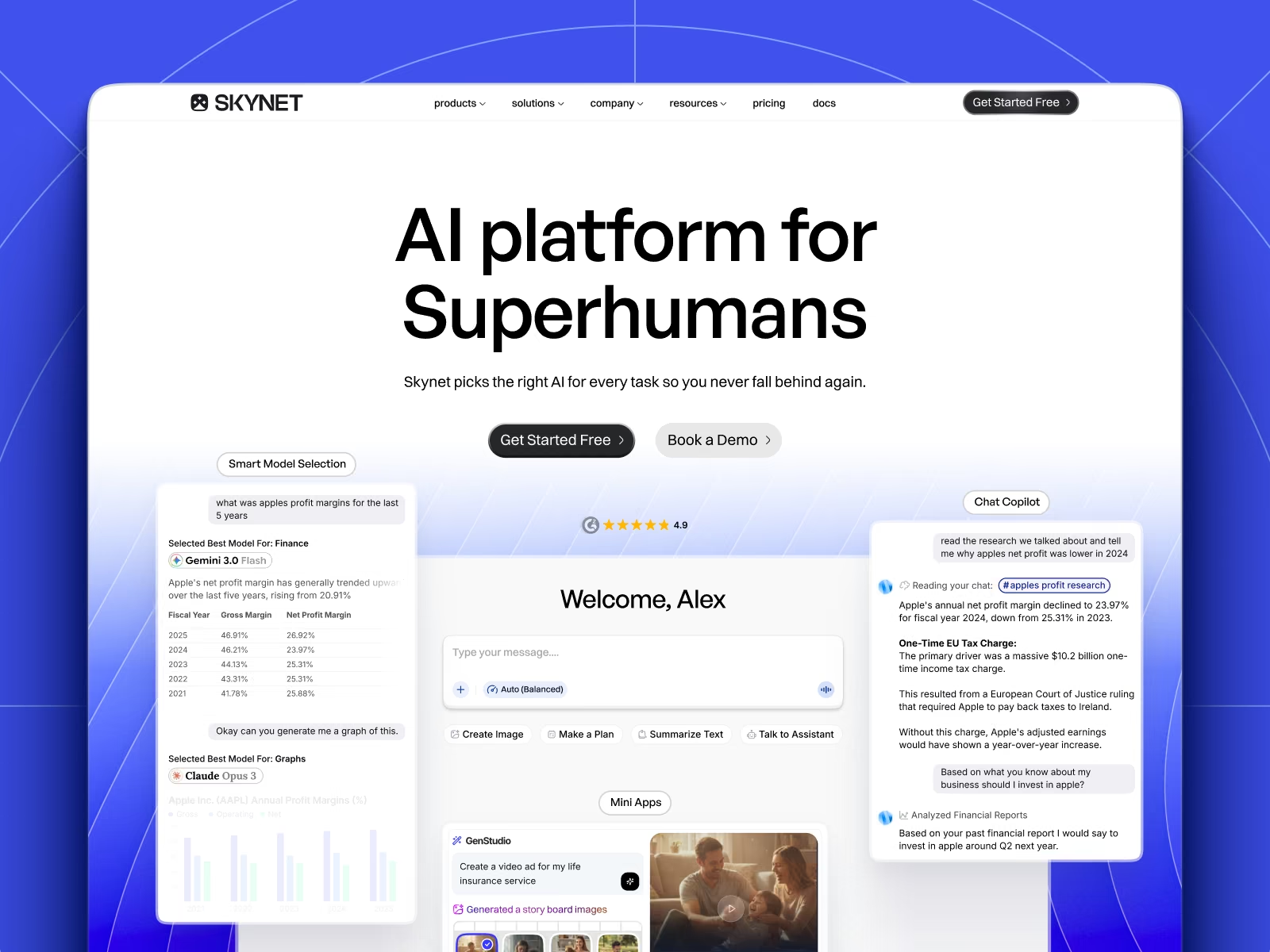
Skynet
Brand identity, marketing site, and product design for Skynet, an AI platform that routes every task to the right model across 20+ providers.
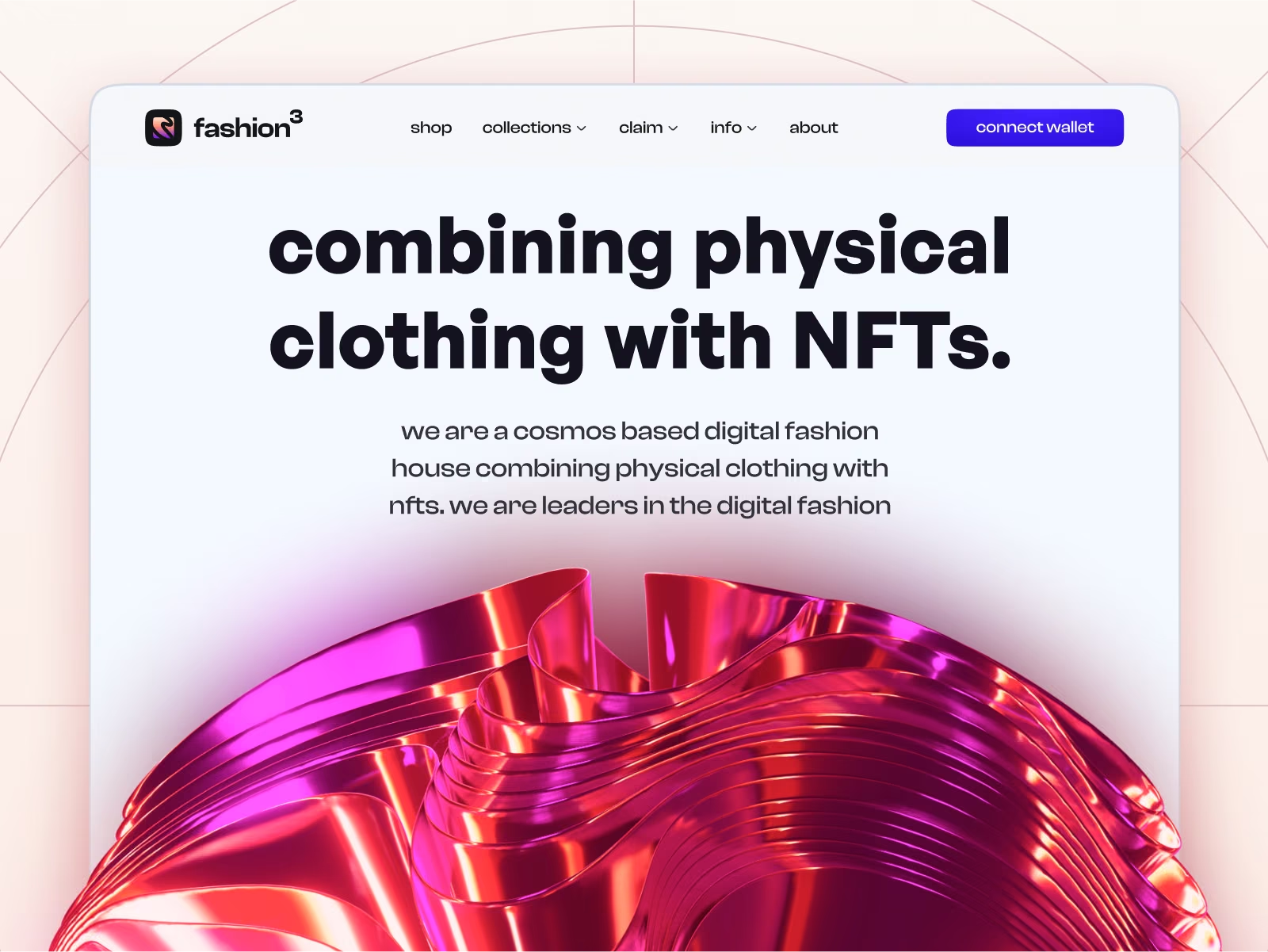
Fashion³
Brand, site, and commerce design for Fashion³, a Cosmos-based fashion house making wearable NFTs that exist physically and digitally.
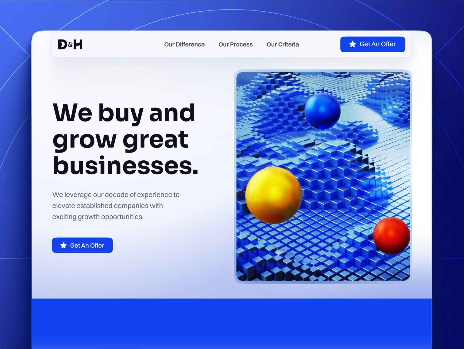
D&H Group
Brand and website for D&H Group, an acquisition firm buying profitable businesses from the founders who built them.
A first direction lands in five to seven working days. A full system with guidelines is typically two to three weeks of subscription time.
No. We will flag anything that looks obviously close to an existing mark, but a proper clearance search is a job for a trademark attorney and you should commission one before you commit.
Usually the better call, and often what we recommend after the audit. We keep what has recognition and rebuild the parts that are not working.
You do — editable Figma sources, exported assets, and the guidelines. Everything transfers with no licence conditions attached.
One flat monthly fee. Unlimited requests. Design and engineering under one roof — pause or cancel whenever you like.